
How design uplifts empathy in this pandemic
| Vimal ‘Malinc – Follow @ medium · 7 August 2020 · 5 mins read |
How design uplifts empathy in this pandemic
 |
Vimal ‘Malinc – Follow @ medium 7 August 2020 · 5 mins read |

Grey times
The year 2020 started with an invisible enemy of mankind and other living things: Covid-19.
It has completely transformed the way we live our life and how we distant from one another to be safe and sound through lockdowns and circuit-breakers, globally. Due to this, many have lost their jobs, their livelihood and finding it an uphill-battle to survive as there’s many uncertainties lingering around.
One of the group of people who are badly affected in this crisis are the needy single-parent families. Having 2-3 kids to feed and take care, it’s really hard to muster the courage to move life forward with these young innocent souls in these grey times.
Coming together
In commemoration of its 56th anniversary, CAS (Civilians Association, Singapore) were planning to help 156 single-parent families in Singapore through 30 days worth grocery-donation.
Being a close friend and well-wisher of mine, Mr Sellvem, Chairman of CAS, messaged me about this initiative. As I was requesting for the link to learn more about the initiative and donate, I was told nothing’s been done than just a vague idea of setting up in an online donation platform, if approved.
I immediately jumped into the opportunity of designing and conceptualizing an identity for the initiative , believing it will help to visually convey the cause and purpose of such amazing initiative:

Blueprint of everyday grocery items

Human figures from Humaaans

Plants illustration – accessories for visual purpose

Finalised identity and theme of the campaign: #HeartfulGiver
Design ✓
Once the design was complete, I’ve finalized the initiative name: #HeartfulGiver which aligns with today’s hashtag trend as well as being an unique name that would stand out. I started preparing collateral designs for social media postings and Ads which will be the primary methods of reaching out to the masses and raising awareness.
Statistics (as of 25 July 2020)
Over the past 30 days, I’ve collated all data related to the campaign and have analysed digitally.
- Ad-Marketing (5 days) 8.3%
- 60 days campaign 46%
- $11,000 / $23,400 49%
- 73 / 156 Families 49%
- 1054 Clicks / Visitors 86%
Statistics attained from https://www.giving.sg/civilians-association-of-singapore/heartfulgiver
It’s amazing to know we have reached half way through our initiative with only 5 days of paid-Ads in social media platforms: Facebook & Instagram. Though most of the contribution came in organically, it was overwhelming to witness how the design and concept has played a vital role in bringing this cause to the masses and seamlessly conveying the purpose of the campaign with just one glimpse of the design.
This easily proves how design can connect with people’s emotions while also standing out uniquely when there’s many other distractions ongoing in social media platforms.
Design Research
To understand the nature of campaign and it’s purpose, I kicked off to design with simple sketches of grocery objects like bread, milk, tin cans and others that we use daily, placed in a cart like basket. This creates familiarity among people and knowing how families can benefit in this tough times with very simple grocery support.
To emphasise care, I’ve placed a heart shape at the centre of the basket which implies how a basket of grocery can uplift people’s spirits with our love. To humanize the overall experience, I’ve also added human figures which is a self-reflection of the donors who can contribute to complete the items in basket.
Human figures from Humaaans
Plants illustration – accessories for visual purpose
Finalised identity and theme of the campaign, #HeartfulGiver
Naming the initiative
As I complete the design, I realised there isn’t any name given to the initative. Raising the concern to Mr Sellvem if he and his organisation have come up with any names, he openly asked me to name something meaningful. As I end the call while staring at the finalised design, the heart symbol captured my attention. It involves care and love, and to appear unique, I decided to go with the word “Heartful”. Also the initiative is only possible with the donors support and I decided to label them as “Giver”. Aligning with today’s Hashtag trends, the name #HeartfulGiver was born.

Sketching ideas and layouts for the map.

” Always understand current status of product and then decide
which stage you should start from.”
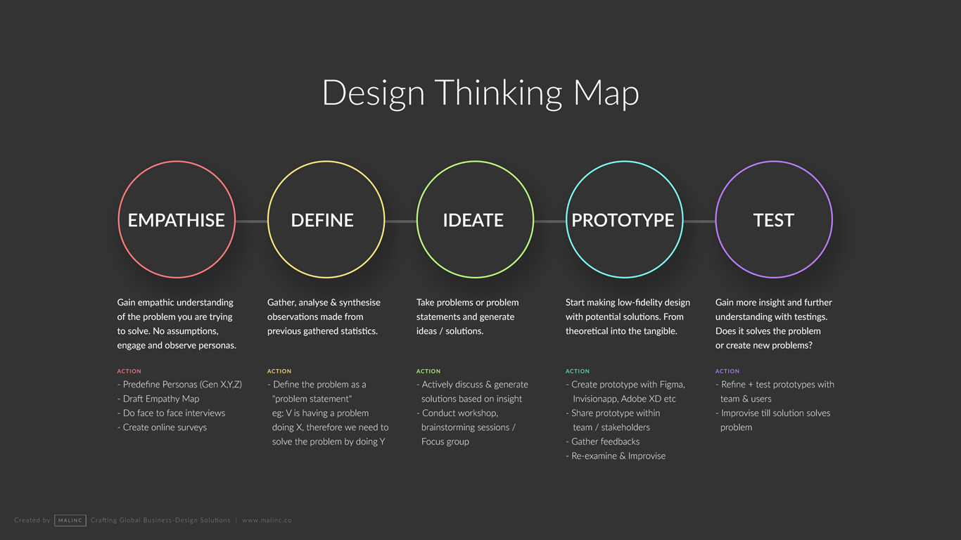
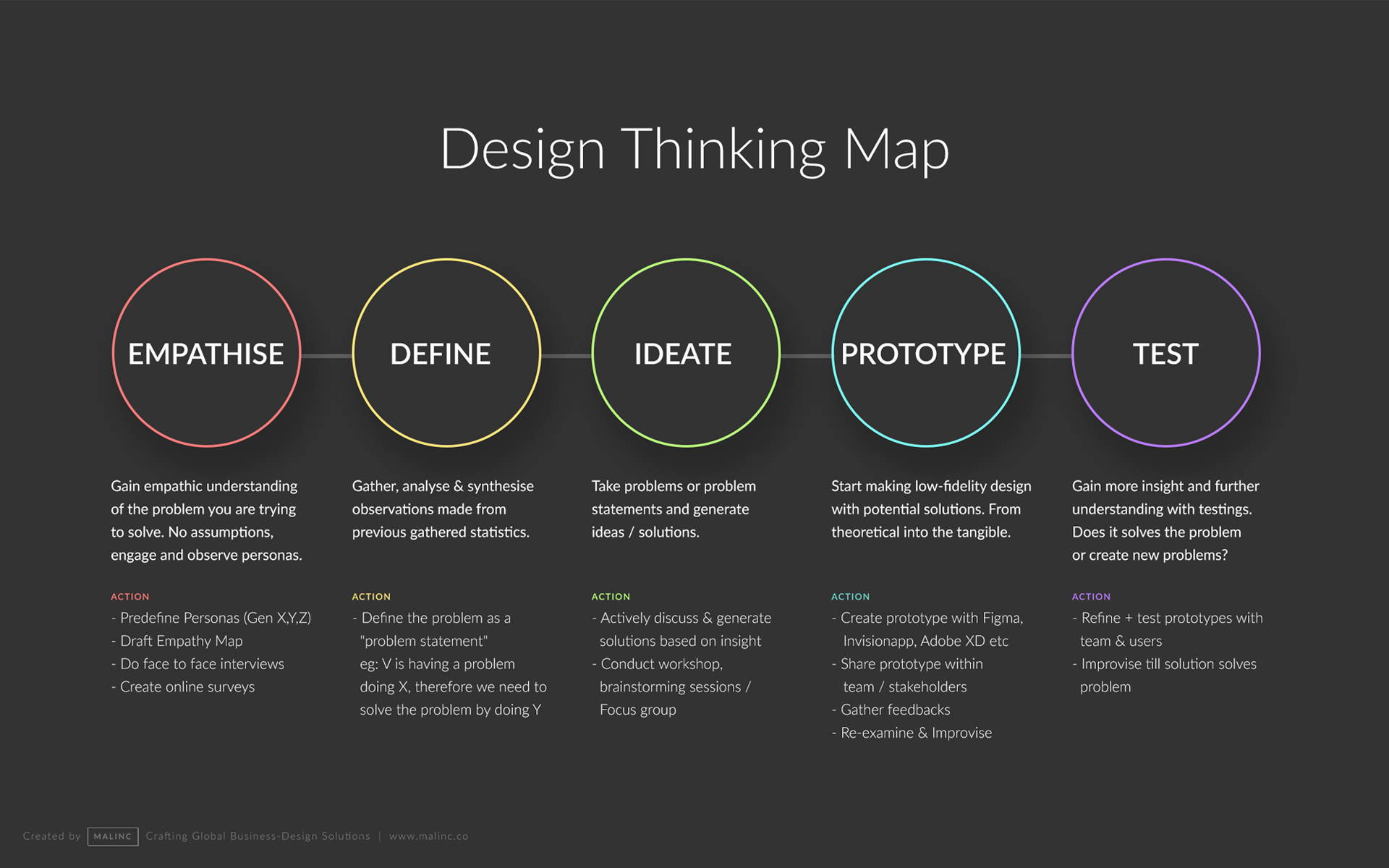
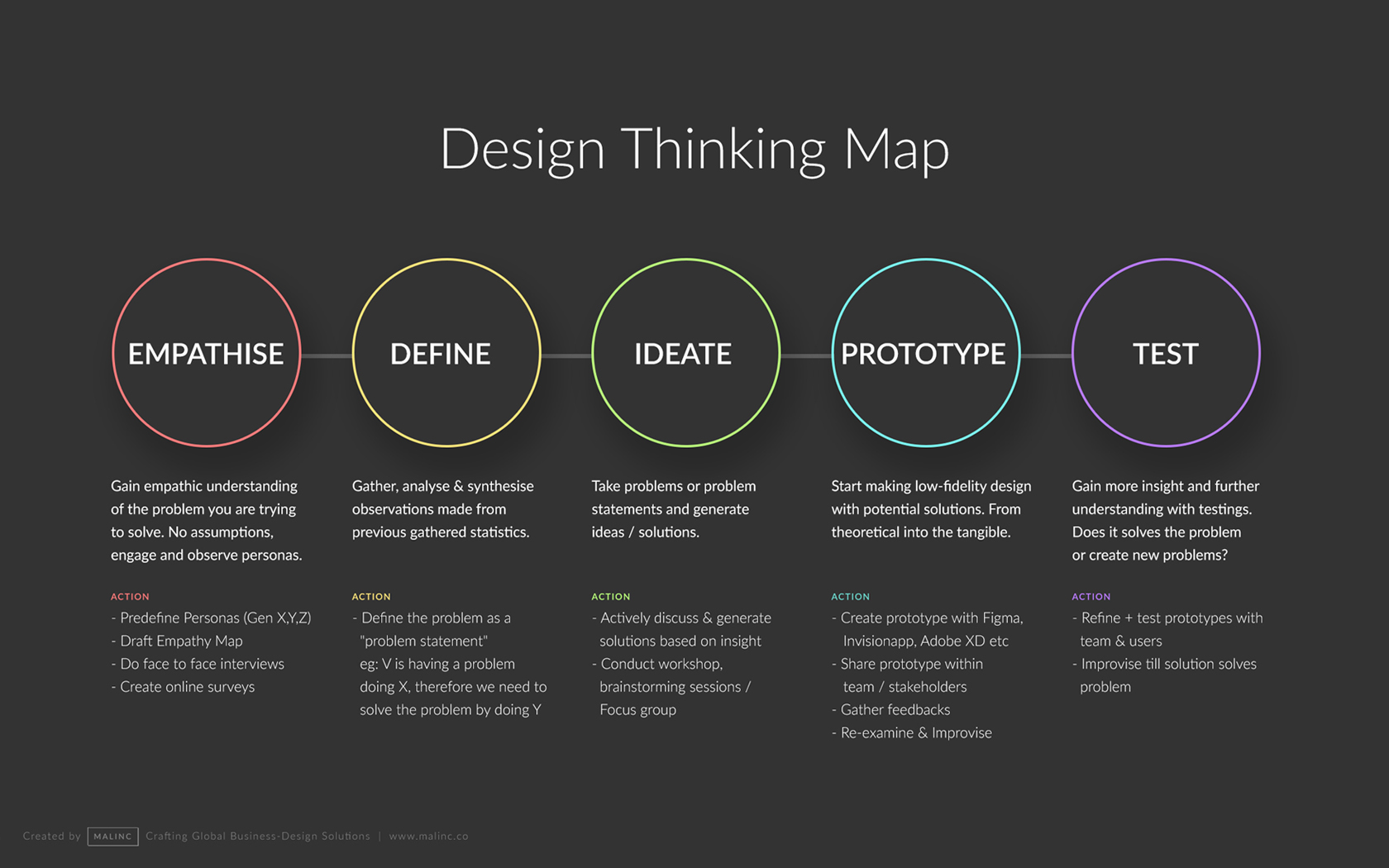
No Start Or End Points
If you notice, the design thinking map has no arrows or any sense of direction of where to start and end. As a UX-designer you need to identify where you should commence your research based on the product and the problem/s faced. Plus there is no flow of which phase comes first, next or before.
If you are designing a new product, You can follow the map from the extreme left then to right (Empathise to Test) but you don’t have to follow religiously. You can skip inbetween or come back when you think it makes more sense then. This will give you great insight about the product and how it can solve problem/s faced by your potential users.

Design Thinking Map wallpaper on my iMac and Macbook. Quick and easy to refer anytime, anywhere.
1. Empathise – Gain empathic understanding of the problem you are trying to solve. No assumptions, engage and observe people.
2. Define – Gather, analyse & synthesise observations made from previous gathered statistics.
3. Ideate – Take problems or problem statements and generate ideas / solutions.
4. Prototype – Start making low-fidelity design with potential solutions. From theoretical into the tangible.
5. Test – Gain more insight and further understanding with testings. Does it solves the problem or create new problems?
I hope this map will help many UX-designers to understand and simplify their role requirement with slick staging of their research and findings. Kindly let me know your thoughts and comments. And don’t forget to download the Design Thinking Map wallpaper below.
P.S. if you have placed the map as your wallpaper, kindly snap a photo and send it to me. Would love to see how it appears on your screen 🙂
To understand the nature of campaign and it’s purpose, I kicked off to design with simple sketches of grocery objects like bread, milk, tin cans and others that we use daily, placed in a cart like basket. This creates familiarity among people and knowing how families can benefit in this tough times with very simple grocery support.
To emphasise care, I’ve placed a heart shape at the centre of the basket which implies how a basket of grocery can uplift people’s spirits with our love.
To humanize the overall experience, I’ve also added human figures which is a self-reflection of the donors who can contribute. Purposely scaling the human proportion to be smaller than the groceries, this metaphors how each contribution, regardless big or small, plays a vital role to the initative.
Download Wallpaper
Select your preferred screen dimension to download wallpaper
If you can’t get the right dimension for your screen, Please email me.
Share
 |
About Author Vimal is a self-taught designer who is passionate about understanding technology, business goals and psychologically translating business concepts into intutive / humanised user experiences while backpacking & exploring the world. |
About Author
Vimal is a self-taught designer who is passionate about understanding technology, business goals and psychologically translating business concepts into intutive / humanised user experiences while backpacking & exploring the world.

0 Comments